整理翻译:设计与设计师(ID:Design-Designer)
作者: Orana Velarde
略作删减,版权归原作者所有,转载请注明出处。
How to Use Pastel Colors in Your Designs
粉彩色在设计中的运用
[+15 Delicious Pastel Color Schemes]
[+15种让人垂涎欲滴的粉彩色配色方案]

One of the top design trends of 2018 that will continue in 2019 is the use of pastel colors. We’ve seen the trend across websites, branding schemes, fashion, social media, and interior decor.
2018年延续到2019年,最流行的设计趋势之一是使用柔和的颜色。我们已经在网站、品牌策划、时尚领域、社交媒体和室内装饰设计上看到了这一趋势。
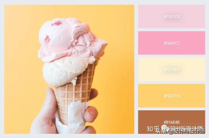
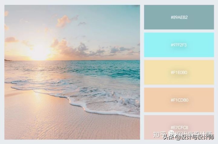
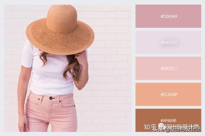
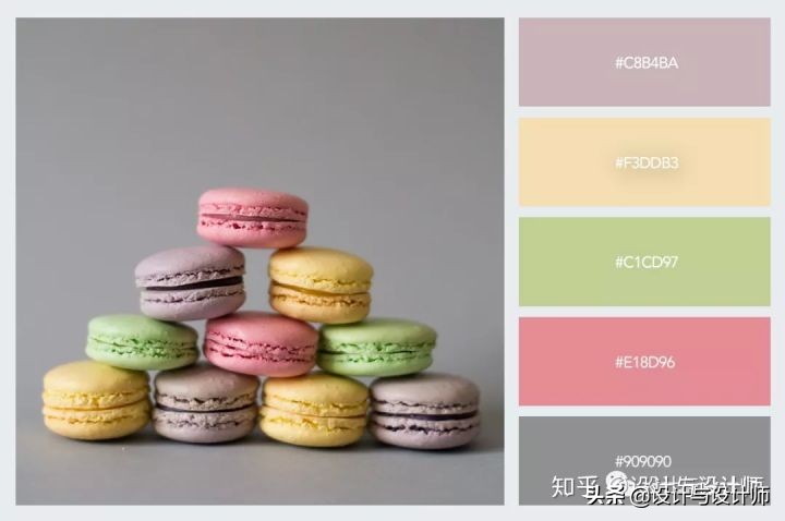
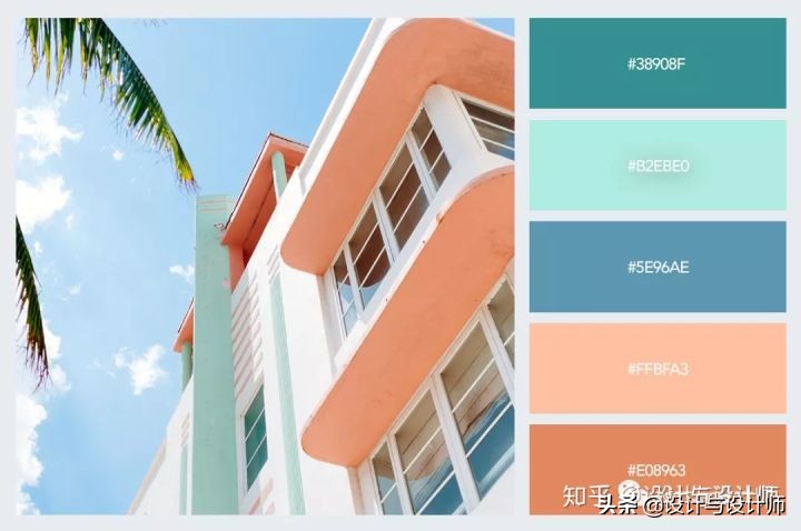
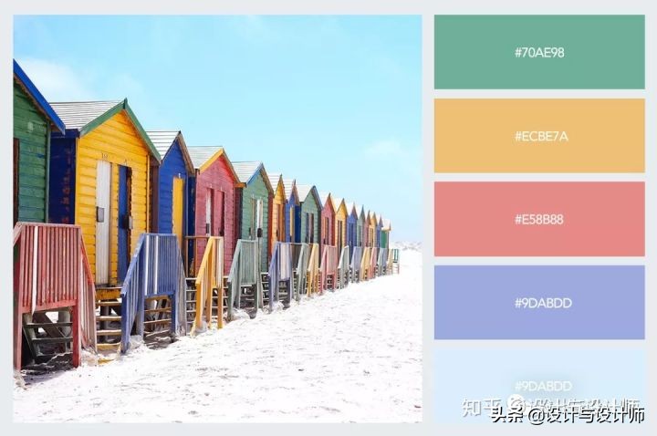
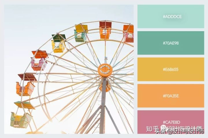
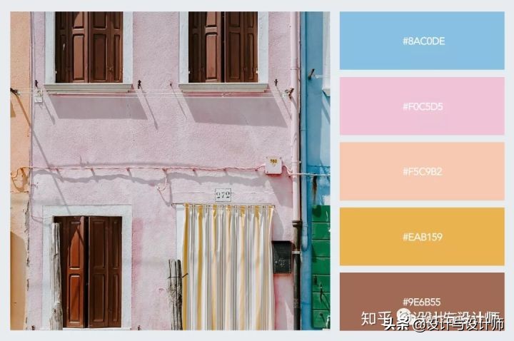
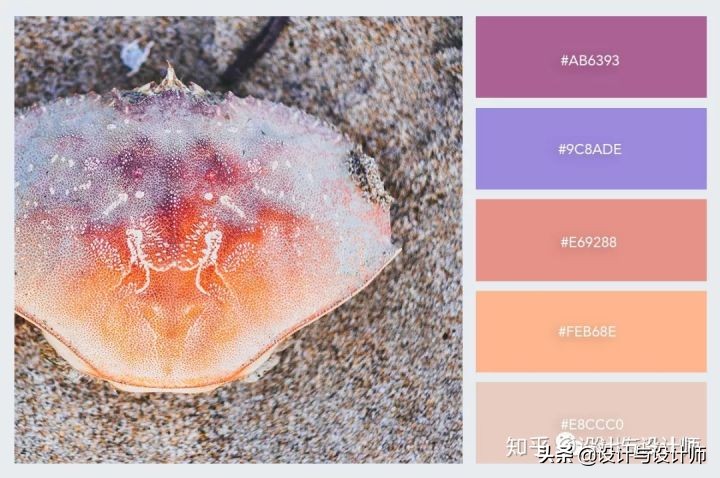
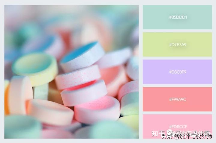
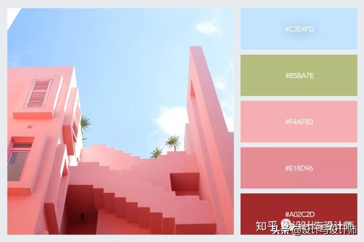
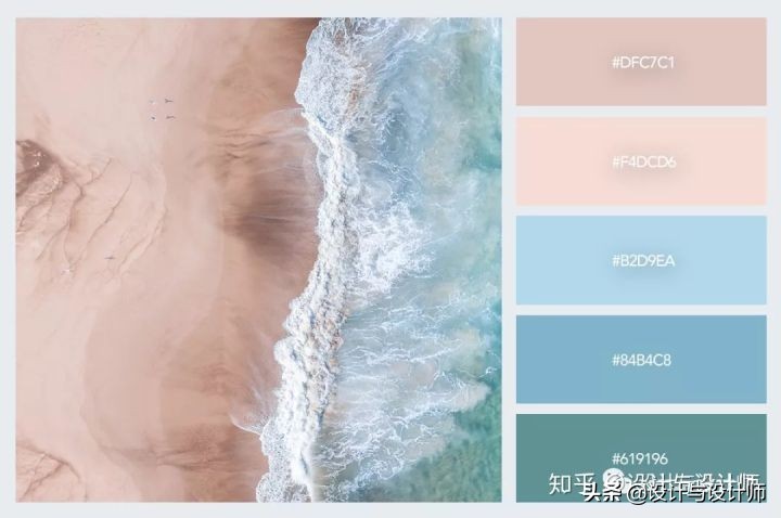
But what exactly defines a color as “pastel"? A pastel color is any color that has just enough white mixed into it to look pale and soft while maintaining its colorful personality. The most common pale colors we’ve seen this year are soft millennial pink, light azure, creamy mint, and whimsy yellow.
不过什么是“粉彩色”呢?粉彩是指任何一种颜色,只要有足够的白色和它混合在一起,就会使颜色显得苍白而柔和,同时保持其丰富多彩的个性。我们今年看到的最常见的浅色是柔和的千禧粉色、淡蓝色、奶油薄荷色和奇想黄。
In this collection, we've gathered our favorite pastel color designs from this past year to inspire your own creations. There's everything from branding schemes and Instagram accounts to fashion, websites, and interior design.
在这个系列里,我们从过去的一年里收集了我们最喜欢的粉彩色设计来启发你的创作。包含了从品牌策划到Instagram账号,再到时尚领域、网页设计和室内设计等等各个方面。
15 Pastel Color Schemes You Can Use in Your Designs
15种您可以在设计中运用的粉彩色配色方案


Pastel Colors in Branding and Packaging
粉彩色在品牌和包装设计中的运用
1.Curl Haircare
卷发护理
This hair care line uses classic pastel colors like pink, sky blue, and soft mint. These three, mixed with black and white in the labels and packaging make a great combination. J.Curl is actually a fictitious brand created for the sole purpose of a branding and packaging design, but the end result is so good that it was featured in design magazines throughout the design community.
这款护发系列采用经典柔和的颜色,如粉色、天蓝色和柔软的薄荷色。这三种颜色,在标签和包装上加上黑色和白色,构成了一个很好的组合。事实上J.Curl是一个虚构的品牌,其创建的唯一目的是进行品牌和包装设计,但是最终的反响非常好,所以在整个设计社区的设计杂志上都有介绍。

图片来源:http://www.behance.net/gallery/69549445/J-Curl-Joyful-Hair-Care
2.Zeithaus Art Direction by Rogerio Aredes
Zeithaus艺术指导罗基里奥·阿雷德斯
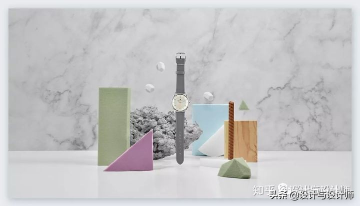
In this creative project, designer Aredes was tasked with the photos and layouts for watch brand Zeithaus. The designer used different materials in pastel colors to create a unique and subdued design that matched the watches and their bands.
在这个创意项目中,设计师Aredes负责手表品牌Zeithaus的图片和版面设计。设计师使用不同的材料,以柔和的颜色,配合手表和品牌调性创造一个独特、柔和的设计。
图片来源:http://www.behance.net/gallery/72183277/Zeithaus
3.Only Good Body Bar Branding
Only Good 美体吧品牌设计
The Only Good brand is an all-natural skin care line from New Zealand. Their pastel branding scheme includes soft pinks, yellows, and creamy grays. The labels are strong and memorable, proving that pastel doesn’t mean “washed out.”
Only Good品牌是来自新西兰的纯天然护肤系列。他们柔和的品牌方案包括柔和的粉红色,黄色和奶油灰色。这些标签非常醒目,令人一见难忘,证明了粉彩色并不意味着“被淘汰”。

图片来源:http://mindsparklemag.com/design/good-body-bar-branding/
4.Le Pastel Branding Scheme by Claudia Argueta
克劳迪娅·阿古塔的Le Pastel品牌规划
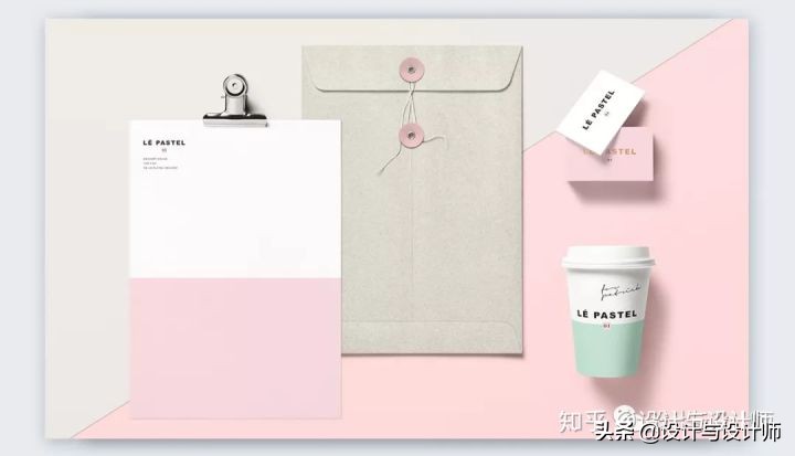
The branding scheme for Le Pastel is a classic pastel combination of millennial pink and neo mint with a soft concrete gray for balance. The addition of gold letters raises the bar for this elegant but fun design.
Le Pastel的品牌规划使用的是经典的柔和风格,结合了千禧粉和新薄荷色,以及柔和的混凝土灰色,以求平衡。金色字母的加入让这个优雅而有趣的设计提高了高度。
图片来源:http://www.behance.net/gallery/31501247/L-Pastel
5.Home Sweet Sushi Kids Packaging
Home Sweet寿司儿童包装
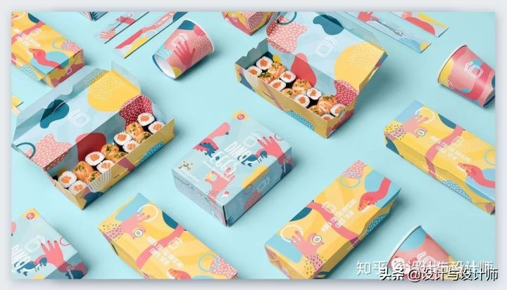
Some pastels have a smaller amount of white mixed in and are on the verge of not being pastel at all. Nevertheless, they maintain their pastel qualities but are also more vibrant. The designers at Savvy Agency chose these strong pastel hues in their packaging design for a sushi restaurant. The client wanted designs done for the new kids’ menu and packaging, which were a huge success.
粉彩颜料中混入更少比例的白色,而且处于完全不属于粉彩颜料的临界边缘。尽管如此,它们仍然保持着柔和的品质,同时也更有活力。Savvy Agency的设计师在为一家寿司餐厅的包装设计中选择了这种强烈的柔和色调。客户要求设计新的儿童菜单和包装,这无疑是一个巨大的成功。
图片来源:http://www.behance.net/gallery/66915439/Home-Sweet-Sushi-Kids
6.Twice Fashion Handbags by Socio
Twice Fashion手袋品牌设计
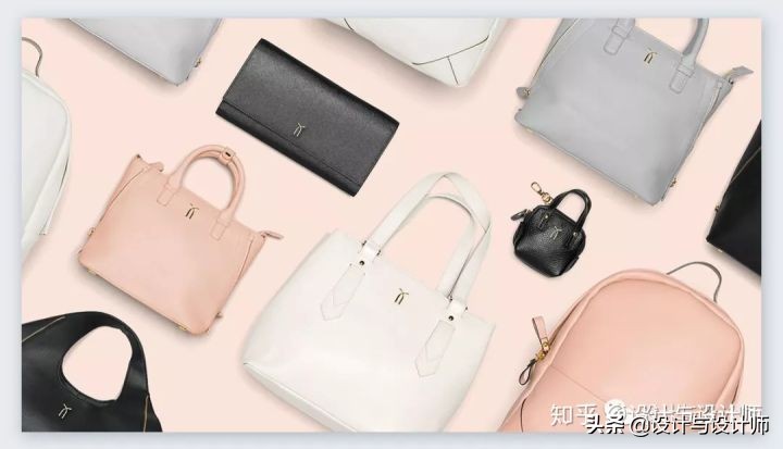
Fancy handbags are the ultimate accessory for the modern woman. As so, they follow the trends and styles of the moment. These handbags by twice fashion are made with neutral pastel leathers and photographed with pastel backgrounds for a clean display of luxury. The black details bring it all together.
高档手袋是现代女性的终极配饰。因此,它们紧跟当下的潮流和风格。twice fashion手袋采用中性粉彩的皮革制成,并用粉彩色的背景拍照,干净利落地展示奢华。黑色的细节把这一切都融合在一起。
图片来源:http://www.behance.net/gallery/30301103/Twice-Fashion
Photography
摄影
1.Ethereal Photography Experiment by Simon Kampfer
西蒙·坎普弗的空灵摄影实验
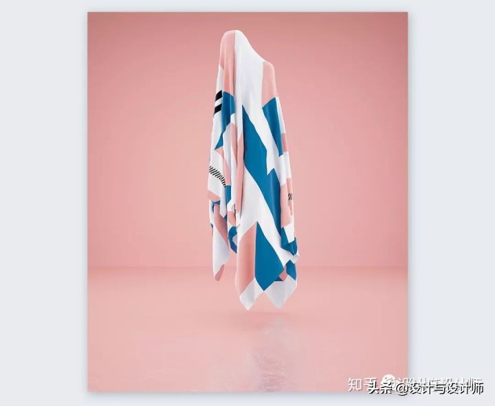
When photographers and creatives do things on their own time, the results are usually amazing and unforgettable. This photoshoot called “Ethereal” by photographer Simon Kampfer uses textures with pastel colors as fabric over floating beings. The images are beautifully surreal and perfectly pastel.
当摄影师和创意人员在他们自己的时间里做事情的时候,结果通常是惊人的和令人难忘的。摄影师西蒙·坎普弗(Simon Kampfer)拍摄的这张照片名为“空灵”(Ethereal),他用粉彩色的布料覆盖在漂浮的生物身上。画面是美丽的超现实主义和完美的粉彩。
图片来源:http://www.behance.net/gallery/72357199/ethereal
2.SadGirl 404 Not Found photoshoot by Kelly and Kwokin
Kelly和 Kwokin莎德女孩404没有找到照片
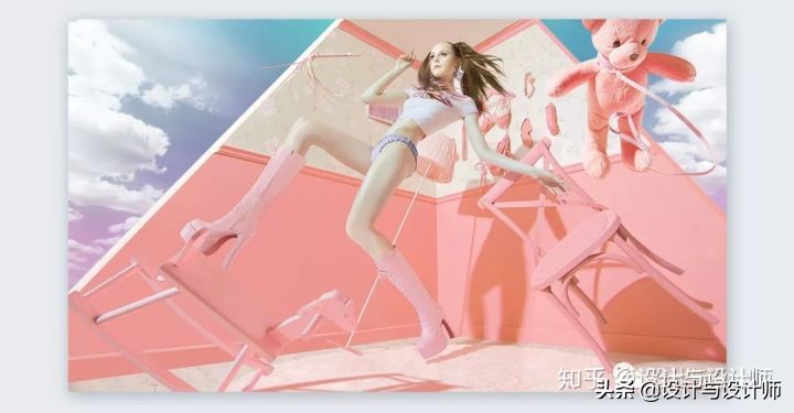
This is another example of a photographer doing work for their own enjoyment. This photoshoot is amazingly futuristic while also beautifully candy pastel. The colors around the model are strong and powerful while also light and airy. The coloring in the photo makes the model’s skin into a pastel hue like the rest of the composition.
这是摄影师为自己的乐趣而工作的另一个例子。这张照片是惊人的未来主义,同时也美丽的糖果粉彩。模特周围的颜色强烈而有力,同时也轻盈而通透。照片中的颜色使模特的皮肤和构图中的其他部分一样变成了一种柔和的色调。
图片来源:http://www.behance.net/gallery/46651139/SADGIRL_404-Not-Found
Illustrations
插画设计
1.Illustrations by Putri Febriana
Putri Febriana的插画设计
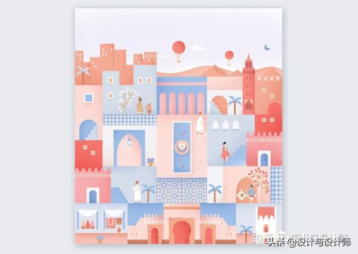
Indonesian illustrator Putri Febriana has mastered the use of pastels in his beautiful illustrations. He uses subtle gradients to give depth to his colorful designs about the cities he visits. His Instagram account is a gorgeous source of pastel inspiration.
印度尼西亚插画家Putri Febriana已经掌握了在他美丽的插图中使用粉彩色调。他用微妙的渐变为他所访问城市的多彩设计增添了深度。他的Instagram账号是粉彩设计风格灵感的绝佳来源。
图片来源:http://www.behance.net/gallery/43739543/Postcard-from-Morocco
2.Down the Street Designs
Down the Street Designs插画工作室
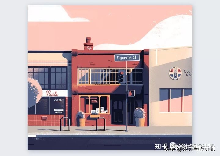
Illustration and design studio Down the Street Designs has a great collection of pastel-colored illustrations for high-class clients as well as personal projects. Their illustrations have an added grunge texture and an amazing light and dark harmony.
Down the Street Designs插画和设计工作室为高级客户和个人项目收集了大量的彩色插画。他们的插图有一个额外的绿色纹理和惊人的光和黑暗的和谐。
图片来源:http://www.behance.net/gallery/71828939/Exploration-Illustration-2
Instagram Feeds
Instagram 博主
1.Candy Minimal on Instagram
Instagram上的Candy Minimal活动
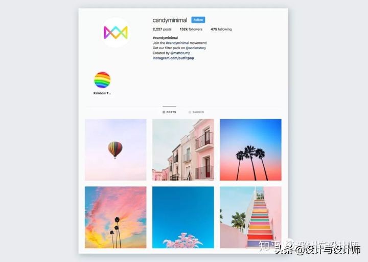
Candy Minimal is a photography movement on Instagram which involves lots of pastel colors mixed with vibrant neons. The color trend got so popular that the team behind A Color Story and A Beautiful Mess asked the creator of candy minimal to put together a filter pack for A Color Story. The Candy Minimal filters will help turn your photos into gorgeous pastel compositions.
Candy Minimal是Instagram上的一项摄影运动,它包含了许多柔和的色彩和充满活力的霓虹灯。这一色彩趋势如此流行,以至于《color Story》和《A Beautiful Mess》背后的团队要求Candy Minimal的创造者为一个色彩故事制作一个过滤包。Candy Minimal过滤器可以将帮助您的照片变成华丽的粉彩组合。
图片来源:http://www.instagram.com/candyminimal/?utm_source=ig_embed
2.Matt Crump on Instagram
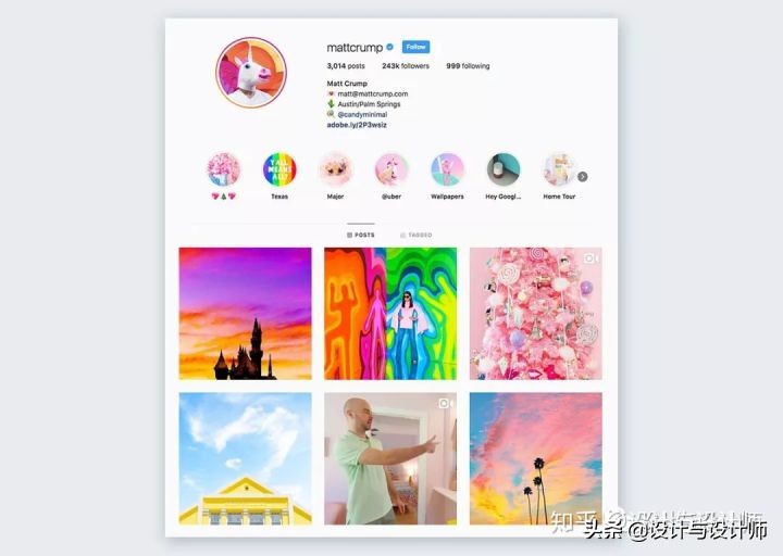
Matt Crump is the creator of the candy minimal trend and his Instagram is a pastel color delight. Follow him for a daily dose of pastel inspiration mixed in with rainbow hues and vibrant neons. If gorgeous pastel visuals could be given a label, it would be Matt Crump and his Candy Minimal.
马特·克伦普(Matt Crump)是糖果简约潮流(candy minimal trend)的创始人,他的Instagram柔和的粉彩色传递给人一种愉悦感。关注他,每天柔和的灵感与彩虹色和充满活力的霓虹灯混合在一起。如果可以给华丽的粉彩视觉效果贴一个标签,那一定是马特·克伦普(Matt Crump)和他的candy minimal莫属。
图片来源:http://www.instagram.com/mattcrump/
3.Visual Snack Instagram Curation
视觉点心Instagram创意
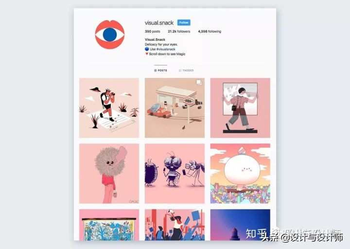
There are plenty of creative curation Instagram accounts, but Visual Snack is special. Even though they showcase different artists, they choose the art they feature to fit a specific color gradient design. Pastel colors have been present many times; at the time of writing this collection, their profile featured a creamy pastel color.
Instagram上有很多创意策划账户,但Visual Snack是特别的。虽然他们展示的是不同的艺术家作品,但是他们也会选择他们所擅长的艺术来适应特定的色彩渐变设计。粉彩色在推送中出现的频率很高;在写这个系列文章的时候,他们的个人资料的特点是奶油粉彩色。
图片来源:http://www.instagram.com/visual.snack/
4.VanCleef & Arpels
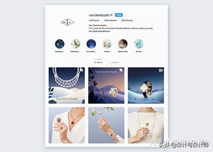
Luxury jewelry brand VanCleef & Arpels has been using pastel colors in their marketing for a while now. The best way to enjoy it is through their Instagram account. Light blues and pastel violets paired with intense night skies or soft greens with off-whites harmonize well to represent the brand seamlessly.
奢侈珠宝品牌VanCleef & Arpels在营销视觉中使用粉彩色已有一段时间了。最好的欣赏方式便是通过他们的Instagram账号。淡蓝色和柔和的紫罗兰色搭配强烈的夜空,或者以柔和的绿色与灰白色的协调搭配,完美地展现了该品牌的特点。
图片来源:http://www.instagram.com/vancleefarpels/
Websites
网页设计
1.Moglea Stationery
Moglea文具
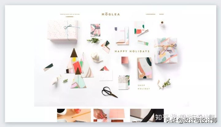
The Moglea Paper Goods and Stationery line is handcrafted in Iowa by a couple of talented artists. Their letterpressed prints, dip dyed paper and hand-painted patterns are beautifully made with pastel hues and soft creams. The notebooks, cards, postcards and wrapping paper collections are gorgeous. Their current Happy Holidays design is perfectly pastel.
莫格莱纸制品和文具系列是由爱荷华州的几位才华横溢的艺术家手工制作的。他们的活字印刷、浸渍染色纸和手绘图案都采用了柔和的色调和柔和的奶油色。笔记本、卡片、明信片和包装纸都很漂亮。目前的Happy Holidays系列设计给人的感觉非常柔和。
图片来源:http://moglea.com/
2.Hop Deco
Hop Deco网站
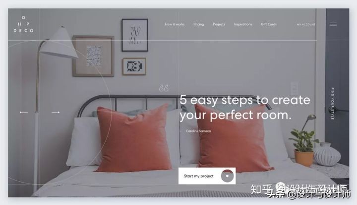
The Hop Deco website is an online graphic design service for people that need help sorting out the design for any room in their house. The example rooms all use pastel hues in the decor, pillows, accessories and furniture. The Pantone color of the year, Living Coral, also makes an appearance on some beautiful throw pillows.
Hop Deco是一个在线平面设计服务网站,专为那些需要进行房间设计的人提供服务。样板间的装饰、枕头、配饰和家具都采用了柔和的色调。Pantone年度流行色“活珊瑚橘”也出现在了这些漂亮的靠垫上。
图片来源:http://hopdeco.ca/en
Interior Design
室内设计
1.Sherwin Williams Color Trend Forecast - Shapeshifter
Sherwin Williams色彩趋势预测- Shapeshifter
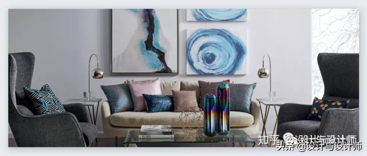
Paint company Sherwin Williams has color forecasting just like Pantone. Every year they create color palettes forecasting interior design trends. One of the palettes for 2019 is called Shapeshifter and it’s a collection of pastels and muted greys, perfect for a calm living room or home office.
像Pantone公司一样,涂料厂商Sherwin Williams每年也会对色彩进行预测。每年他们都会制作预测室内设计趋势的色彩样板。2019年的一个色彩系列叫做Shapeshifter,它是一系列柔和色调和柔和灰色的组合,非常适合平静的客厅以及家庭办公室室内设计。
图片来源:http://www.sherwin-williams.com/homeowners/color/find-and-explore-colors/2019/shapeshifter
2.Ice Cream Colors Decor
冰淇淋色装饰
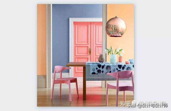
The new pastel hues are vibrant ice cream colors. Interior decorators are using all these colors in one composition for a beautiful effect. Using muted tones to create breaks in vibrancy, this combination of ice cream pastel colors has a wonderful effect on human emotions. Who wouldn’t feel happy in this room?
新的粉彩是充满活力的冰淇淋颜色。室内设计师把所有这些颜色都用在同一个设计效果图中,以达到一种美丽的效果。用柔和的色调来营造活力,这种冰淇淋柔和的颜色组合对人的情绪有奇妙的影响。在这样的房间环境里还会感到不开心吗?
图片来源:http://trendesignbook.com/blog/trends/10-interior-decoration-trends-for-2019/
3.Pastels - The new neutrals
新中性色
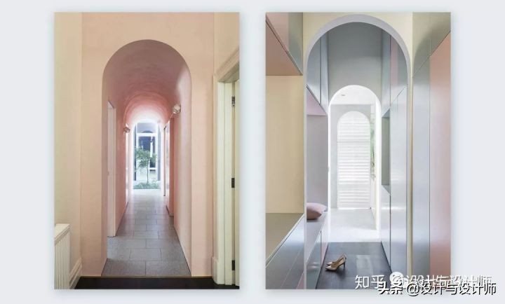
In both the Stockholm furniture fair 2018 and the Milan Design Week 2018, pastel colors made an appearance as the new neutrals. Both of these fairs forecast color trends for the coming year and sometimes subsequent years. Soft pinks, light lilacs, easy yellows along with muted grays are being used as the new calm and neutral palettes. The color that stands out the most and is in the running for being the trending color of 2020 is neo-mint.
在2018年斯德哥尔摩家具展和2018年米兰设计周上,粉彩色都成为了新的中性色。这两场展览都预测了未来一年乃至未来几年的色彩趋势。淡紫色、淡紫丁香、淡黄色以及柔和的灰色正被用作新的冷静和中性调色板。新薄荷色是最引人注目的颜色,有望成为2020年的流行颜色。
图片来源:http://www.italianbark.com/interior-color-trends-2019-pastel-interiors/
Fashion
时装
1.Marc Jabos Spring 2019 - New York Fashion Week
Marc Jabos2019春季 -纽约时装周
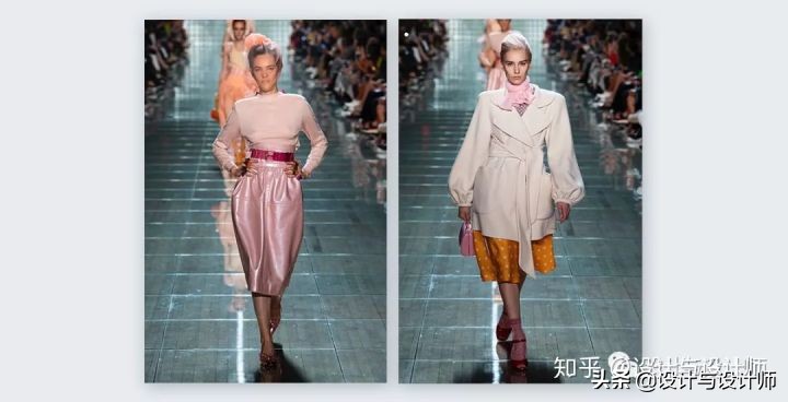
The ready to wear collection by Marc Jacobs for Spring 2019 was full of pastel hues in the clothes, the makeup, and accessories. Harmonized with deep reds, muted greys, intense greens and soft taupes, the pastel color palette shines throughout. There are some really beautiful pastel pieces in this collection.
Marc Jacobs2019年春季成衣系列在服装、妆容和配饰上都采用了柔和的色调。与深红色,柔和的灰色,强烈的绿色和柔和的灰褐色相协调,柔和的调贯穿始终。同时,在这个系列中也有一些非常漂亮的粉彩色作品。
2.Spring/Summer 2019 fashion color trends
2019春/夏时装色彩趋势
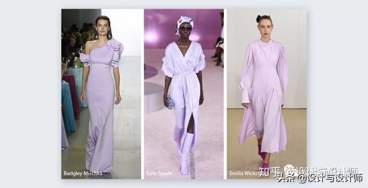
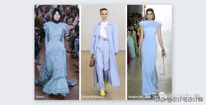
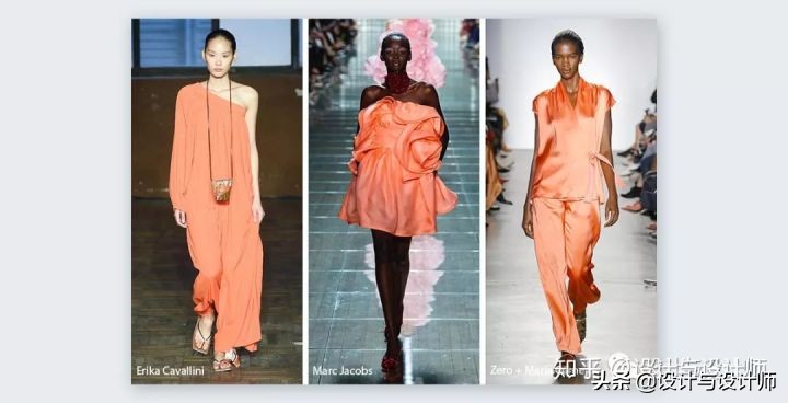
Marc Jacobs was not the only designer showing off beautiful pastel creations on the Spring/Summer runways. Lots of other designers chose pastel hues as well. Some beautiful colors worth mentioning are clearwater blue and light lavender. The Pantone color of the year Living Coral also made a debut.
Marc Jacobs并不是唯一一个在春夏时装秀上展示柔和风格作品的设计师。许多其他设计师也选择了柔和色调。特别值得一提的是像清水蓝色和淡薰衣草这样一些美丽的颜色。Pantone年度色“活珊瑚橘”也首次亮相。
Pastel design assets and tools
粉彩色设计素材与工具
1.Pastel presentation templates
柔和的展示模版
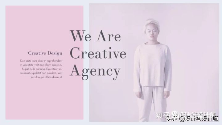
Last but not least, a pastel presentation template can give your slides a fun and colorful look. Along with an elegant sans serif font and some vivid imagery, pastel colors look great in templates like these.
最后,同样重要的是,一个柔和的展示模板可以给你的幻灯片带来有趣和多彩的外观。除了优雅的无衬线字体和一些生动的图像外,柔和的颜色在这样的模板中看起来很棒。
2.Pastel watercolors
柔和的水彩画
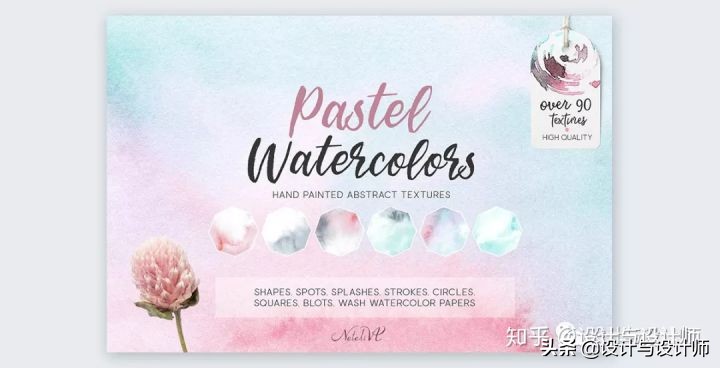
Watercolors are still an ongoing trend in graphics and visuals. Pastel watercolors are perfect for social media images, packaging, and branding schemes. They can be used in anything you like. You can find textures like this on Creative Market or Freepik.
水彩画在图形和视觉效果方面仍然是一个持续的趋势。柔和的水彩画是完美的社交媒体图像,包装和品牌方案。可以用在任何你喜欢的东西上。可以在Creative Market或Freepik上找到这样的纹理。
图片来源:http://creativemarket.com/Natali-VA/2425836-Watercolor-Textures.-Pastel
3.Pastel patterns
粉彩图案
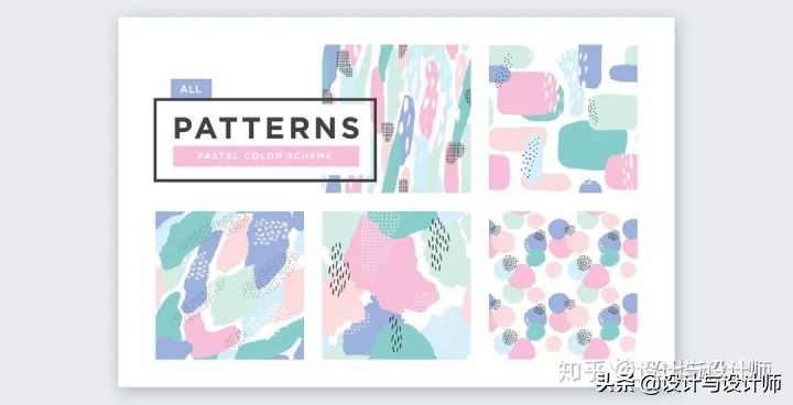
Seamless pastel patterns are a wonderful addition to a pastel inspired design. These can be used as backgrounds, details or sections of graphics. Try them in your newsletters, social media graphics or flyers.
无缝粉彩图案是一个精彩的补充粉彩灵感的设计。这些可以用作背景、细节或图形部分。可以在你的时事通讯、社交媒体图片或传单上试试。
图片来源:http://creativemarket.com/anugrahadesign/1703128-Abstract-Seamless-Patterns.
4.Pastel Instagram Stories
柔和的Instagram主题
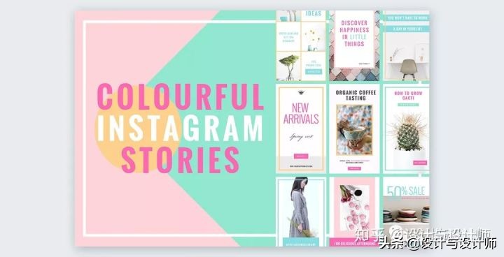
The easiest way to get a grip on Instagram stories is to use templates. A pastel stories template collection is perfect for staying on trend with your lifestyle brand.
掌握Instagram主题的最简单方法是使用模板。一个柔和的主题模板收集是完美的保持与您的生活方式品牌的趋势。
图片来源:http://creativemarket.com/NordWood/2116996-COLORFUL-Instagram-Stories
5.Floral Business Cards
花的名片
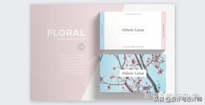
Yes, pastels can also be used in business cards. They might not always be trending, but if they match your brand and style, then they can work just fine. This business card template, for example, has light pinks and blues along with cherry blossoms and a classic white.
是的,粉彩色也可以应用在名片上。它们可能并不会一直流行,但如果与品牌和风格相匹配,那么就可以很好地为品牌服务。例如,这个名片模板有淡粉色和蓝色,还有樱花粉和经典的白色。
图片来源:http://elements.envato.com/floral-minimal-business-card-MPQ3BW?_ga=2.92012447.461105652.1544447039-677848927.1544447039
How about you?
你的观点呢?
Have you been using pastel colors in your visual creations lately? Why not try them next time? Your presentations or your social media graphics can be revived with any of these pastel colors.
你最近有没有在你的视觉创作中使用粉彩色呢?下次为什么不试试呢?您的演示文稿或社交媒体图形可以使用这些粉彩中的任何一个哦。
本文由“设计与设计师”整理翻译
英文原文,请点击“阅读原文”,转载请注明出处
免责申明:公众号宗旨是收集好的资料分享,非盈利性质。部分内容来源于网络或网友自主投稿编辑整 理,版权归原作者所有,其内容为作者个人观点,并不代表本公众号赞同其观点和对其真实性负责。如您(单位或个人)认为本公众号某部分内容有侵权嫌疑,请通知我们,我们将第一时间予以更改或删除。





暂无评论
发表评论